 Now, on this tree I am going to have the upper half of the tree catching more light and the lower section in shadows. I like the darks here but I want the bottom really dark so I'm going to add a little more of my dark mix down there to darken that part more. That gets me to this point...
 That look pretty good so lets get started adding the mids....
Step 2 Adding the Mid Values...
...or Middle values which are a lower value green mix. In other words trees are like dark green, green and yellow but we adjust all that depending on the tree. Since there are all of these color variations with trees I just call them darks, mids and highlights. My mid green is going to be the same color combination as the darks mix but with less Alizarin and more Cad Yellow Pale. Here is what it looks like as we begin...
 I began by painting thicker mids at the top of the tree and thinner towards the bottom with a light touch of the brush. Most of the mids will be covered by highlights but you can choose to leave as much of your mids showing as you like. The mids here will show as a slight ring around my highlights.
Step 3..Adding Highlights...
Here you can see how I have blended the highlight mix to the sunlit area. This mix is the same as before but with more Cad Yellow Pale. I faded my highlights from top to bottom and left to right. My light sorce is from the left so I'm leaving the darker colors to suggest shade on the right side of the tree.  Step 4 Skyholes and Trunks...
After the foliage is done we need to add some light peeking through the trees and to hep us shape our tree better. I use just a slightly darker shade of my sky mix to add skyholes. For turnks and branches I've just added light strokes with white and a bit of my dark mix added.
 and now the trunks and branches...
The only thing I do after this step is to go around and tweak the tree up...a dab of color altered here and there, some edge work etc...just little things to make it look good.
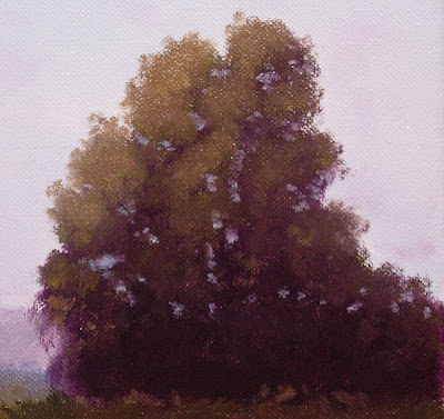
I think that's a pretty convincing Eucalyptus tree...not the pom pom type of Euc, more the bush looking one that my neighbor has. I have both on my property. So, these are not as hard as you might have thought. Remember, darks, mids, highlights, skyholes and trunks...that's it. Below is how the tree looks in the competed painting....Hope you got something out of this and give it a try.
 "Prelude To Evening"
9"x12"


 The view to the top of the peninsula Mustard abounds....
 Me, working it up on the 9"x12" panel. This was a great spot. The field in from of me used to be a bean field way back in the 40's.
 Walk to the edge of the bean field and this would be your view down onto the Pacific Ocean. Is this place awesome or what!

 the finished painting.....needs a brush for that mustard!
 Poppies with a yellowish tint


 Next thing to do was come up with some cool rows of grapes with leaves. I had snapped some ref photos at another vineyard while doing a show there so I used their grapes.
 Here are the vineyards sheep who posed for me while eating lots of grass....any grass!
 I took these images into Photoshop and put together an image that worked...sent it off to the vineyard for approval and then drew the image on illustration board in light pencil to begin inking. They wanted an oval format and I played with the values in black and white to make the image work better for their sake.
 My drawing is lighter here. I tend to draw light but that's ok because in working with various printers I found the printing ink usually darkens any drawing a few values. They use the blackest ink I've ever seen for printing. I let the owners know about this and even asked them to reduce the vlaues a bit to make it look better. I didn't like the values in my original drawing...too light and it looks better notched down a bit.
 Here is a preview of what the label will look like. They liked it a lot. They will bottle the wine next August and release the wine in Feb 2009. A long wait but it will be fun to see the label.

 I like keeping some degree of detail in the distant backgrounds but also staying very suggestive with it. Balancing suggestive and detail takes work. It looks easy but it took me a while to get them the way I wanted.
 Keeping from painting too tight and too detailed on the cars is something I'm reminding myself as I paint. I painted that front van where it looked pretty straightedged but then went back in and loosened it up a bit.
 Here is the finished painting....it's a scene looking up Myrtle Ave in Monrovia, CA. I've been up this street many times in my life. When I was a kid my Mom used to drive us to JC Pennys which was on the right hand side in this scene. My older brother had to have JC Penny t-shirts so that's where my Mom would take us. Pennys moved to the Arcadia Mall way back in the 70's but all of the buildings on this street are all the original buildings from back then. I used to work just down the street in the 90's. I've been amazed at the work of


 I began with my sky colors and then the mountains base colors. I'll add the mountain shadows next. I've also added spots of sky color that will be behind the trees.
 Now I put in my mountain shadows and at the same time fill in an area that is toweards the valley floor...fields etc...nothing exact, just suggestive work here.
 I now begin adding my darks. This is various mixes of Ultramarine Blue, Cadmium Yellow and Alizarin Crimson.
  It's time to put in thwe road and my mid greens. It's starting to come together now. I felt my deer looked a little low so I will move him up a bit before painting him in.
 This is how I will move my deer up. I first paint in the area under the deer to fill in that area.
 Now, I will scrub out the painted area that is still wet on the road where my new deer position will be. I use a small clean brush with turpentine to scrub the shape of the deer out. Wipe it off and soak up more of the now diluted paint until the area is clean.
 I scrub out just enough of the wet paint to have a nice pretty dry area of canvas to paint in the new deer. I'm not the greatest wildlife painter so please excuse my deer. Maybe if I do a lot more deer I'll get them down better. I tried to keep good loose edges on my deer but I could have gone a little looser I think.
  My favorite part of this painting is the nice contrast of the dark green oaks and the far side of the canyon mountains....nice!

