Monday, February 07, 2011

Mojave Desert Light


"Mojave In Gold"
24" X 30" Oil on Canvas
This was painted from reference photos taken near the town of Little Rock, CA up in the Mojave Desert. The plan was to go plein air paint that day but I kept stopping on the way there so by the time I got there it was late afternoon and super cold. Instead of painting I just took reference photos until the sun went down. Not a waste of time since reference photos would give me what I needed to do paintings here in the studio. This area is just above Pearblossom highway and sundown was bringing in some awesome light. I love the desert in the evening and enjoy what the light can do to the colors up there. I think I could spend the rest of my life trying to capture the colors of the Mojave...even the dirt looks good when the sun is just right.

Tuesday, February 01, 2011

Eaton Canyon At Dusk


"Eaton Canyon At Dusk"
36" X 48" Oil on Canvas
A large painting of Eaton Canyon just before sunset. This scene was down in the riverbed in Fall this last year. Being a riverbed in a canyon there were plenty of rocks to paint so I took the liberty of editing many of them out of the scene. This allowed me to add more of the sandy bottom of the streambed and keep things not so busy in the foreground area. Took a few days to paint this one due to the large size but it went pretty smooth. The mountain sides of the canyon are an area I'm still working out to get to the point of feeling comfortable painting them and really loving what I end up with there. I like the progress so far with that part of these canyon paintings because the San Gabriel mountains to me are very hard mountains to paint. Lots of rocks and scrub brush so it is sort of a nightmare to handle for a painter.

Wednesday, January 12, 2011

In The Arroyo


"In The Arroyo"
22" X 28" Oil on Canvas
I was heading to take reference shots of the Colorado St bridge at the Arroyo Seco in Pasadena. Along the way the path went by these nice sycamore trees casting some nice shadows under the dense canopy. I've been trying to paint more sycamore trees so I decided to paint this scene....shadows, sycamores...win/win. Fun painting to do and full of small challenges along the way. This is a busy painting and one I would have stayed away from painting a couple of years ago. I'm feeling more confident with these types of scenes and am starting to enjoy their challenges. The background foliage is mostly just suggested work and after the initial colors are blocked in it becomes just a matter of suggesting leaves and shadows with bits of color notes. In the end it looks more than it really is...all a matter of suggestion which goes a long way in painting. Below are two images of the early stages of this painting .

Above you can see the background "tree" colors blocked in and at this stage I was starting to add "leaf" detail. Just blocking in the underlying background colors fills up the canvas pretty quick. I did this stage before going to bed and thenit overnight tacking up so in the morning I came back to it and just starting dabbing in the "leaves" and edges of the blocked in colors.

In the upper image you can see more of the background suggested color nots are in and I'm moving on to blocking in the dried leafy trail floor. Once these colors were in I went back over them scumbling with a worn brush and knife adding detail to that area. After a while I just jumped around the canvas dialing it all in until it looked and felt finished....and that's it.

Friday, January 07, 2011

Eaton Canyon


"Eaton Canyon Meadow"
22" X 28" Oil on Canvas

It seems everytime I go to Eaton canyon I end up in the meadow. It is just as you cross the water when hiking from the parking lot of the nature center there. There are some giant oaks and sycamores that line the meadow on one side and the bottom of the San Gabriel mountains on the other. This is the kind of trail my brother and I used to love running along playing as kids set free in the mountains. Lots of fun painting this one.

Here is a detail of the painting.....

I had the good fortune to visit the canyon 3 or 4 times this past year and that's pretty cool considering I now live over 130 miles away. When I was a kid we used to ride our bikes up to the canyon...or just walk if someone had a flat tire. They had the coolest pictures of a hiker who had been biten by a local rattlesnake. Our hikes were mostly in summer so it got pretty hot in the canyon by afternoon. Now I like to go there either in early morning or later afternoon to watch the colors of the San Gabriels ignite as the sun falls into the Pacific ocean. Sometimes the mountainsides are the most amazing pinks, reds and peach colors....just awesome to see this at various times of the year.

Sunday, January 02, 2011

Spring Blooms


"Spring Blooms"
9"x 12" Oil on Panel
A painter buddy of mine, Rich Gallego, finished the year with a painting I saw and that was all I needed to get his kick in the butt to do a painting before the year ended but it was less than an hour away from midnight on New Years night. I started this one but had to stop to do the Champagne thing, haha. I finished it today after getting caught up with other needed things. This was painted from a small 5x7 study I did a few months back. I realy liked certain parts of the study and wanted to try a bit of a larger painting. I like the far off mountains but wish I had placed them just slightly higher. I also like the textures and bits of pure color in the foreground poppies. Some paintings are just fun to paint and this was one of those types of paintings....fun one to start the new year off with.
Happy 2011!!!

Saturday, December 18, 2010

Summer Above Los Olivos


"Summer Above Los Olivos"
8" X 10" oil on panel
I finished this one just now while enjoying the Pacific storm that rolled in yesterday starting as light drizzle but was pouring all night and this morning. Hopefully Lake Cachuma will fill to it's top with this good chunk of rain we're getting. This hillside is just north of the tiny town of Los Olivos, CA. I drive up there a lot in summer to check out the colors and see what nature has created for artists to have fun with....nature never lets us down.
I had to run down to take Linda Christmas shopping down in Goleta yesterday and was only too happy to find out they now have a Hawaiin BBQ restaraunt there. Yummy! Guess where I'll be stopping on my way down to Pasadena in the future???

Christmas is almost here so in case I don't post anything before then I want to wish everyone who reads this blog a very Happy Christmas and a much better New Years than last year, hahaha.

Tuesday, December 07, 2010

Nipomo Meadow


"Nipomo Meadow"
30" X 40" Oil on Canvas
This meadow had such a nice bit of sunlight splashed across it when I was up here at the eucalyptus stands in Nipomo off of Hwy 101. I tried to catch that light and still get a nice sense of the darks in the foreground. There were a lot of greens in this painting so it was nice to work on variations of that. You can never get enough practice with greens in landscape work.
I like the large size on this one too and am finding myself really building much more confidence at larger works. This would have taken me forever to paint a few years ago but now it is much faster. Really concentrating on my grasses the last two years has really paid off. It's hard to see most of the detail in the grasses here but on the actual painting they look pretty cool.
I'm still using the Utrecht Artist Oils and really enjoying the process of dialing my mixes in with them. To me the Utrecht paints are very similar to Winsor & Newton Artist Oils. So far so good with the Utrecht's.


Tuesday, November 23, 2010

Artist Studio Tour 2010

Part of the studio ready to the show early saturday morning
The 2010 Santa Ynez Valley Artist Studio Tour was this last weekend and went very well. That's a big change from last years disaster due to super low sales. Sales were up this year which was a very welcome change. In fact, I had a woman pick up a painting earlier today to take to her home to try it out with the decor and lighting and am waiting on her decision by tomorrow. So this years studio tour has been wonderfully succesful especially when you consider that it rained on both days. Sorry I didn't take any other pictures this year. We had a good amount of people come through so a lot of yaking was going on.
As usual, we offered wine, coffee, cokes and a good selection of snacks to eat. Linda makes what looks like a buffet table and decorates with flowers too. Many of the artists on the studio tour don't go this route figuring they want the people concentrating on purchasing art rather than eating. We've always found that people really enjoy this though...a little pampering so to speak but why not. We've never had a sole tell us they were offended by the offering of a glass of wine and the choice of deciding what to eat....nope, not once.
The crowd as always was a good mix of people who enjoy art. I try and talk with each of them and get a little background on them. It is always interesting to see who really likes art around here and how far they will drive to see the behind the scenes part of it. I make friends and always invite them back. We have a couple of get-togethers before and after the tour for the artists to meet and that's always fun too. Holly Kline and Stacy Ott of the Wildling Museum, which sponsors this event, did a great job and work many, many hours for the tour. I can't thank them enough. Hopefully next years tour will be a success too.

Wednesday, November 17, 2010

Framed in Black

Loosk pretty nifty!

Well, here is the boat painting in the black frame which really has very dark reddish undertones. I like it but then again I had the idea it would look cool in a dark frame. My general consensus is that landscapes with lots of greens go well in your typical gold frames and marine work...usually lots of blues and greys tends to go better with darker frames...ie black.

Of course I could be totally wrong with that thinking but it seems to work....to me, hahaha. How decisive. I'd be the first to admit framing is better handled by the people buying the work. They know what they want it to look like on their walls so why not let them just buy the canvas and head straight to the frame shop. Sure would make it a lot easier for artists to concentrate on just painting....but that would be in a perfect world. It's nice to present work in a decent frame and I've learned that lesson like a struggling artist usually does. You buy the most affordable, and usually, the cheapest looking frames that "most affordable" gets you. Then one day you look at the work of artists in galleries and then go home to look at your framed paintings and want to kill yourself...."what was I thinking!" is probably a sentance most artists have uttered at one time or another.


If you are serious about selling your work to people who want to buy it make sure you buy good frames...not affordable frames. Look around at professional artists whose work you feel is in the realm of your caliber, or vice versa, and pay attention to the frames. Do your frames look like that? If not then start saving your money for better frames. The presentation makes a world of difference and shows to the buyer you feel your work deserves better frames because it's better work. Hate to sound uppity but if you don't value what you create then why should a buyer value it anymore than you do.

Anyway, I think the boat painting looks really good in this frame...looked good in the other gold frame but I think black tends to go better with this painting. They have this really nice looking black frame that was reproduced from an English designed frame used mainly for landscapes at King Of Frame that I think would make this look even better....something to think about trying out as soon as I hit the California Lotto....by the way, King Of Frame has some killer frames and their prices are pretty darned good too....check them out if you haven't already.

Monday, November 15, 2010

Framing

I've got this one Larsen Juhls frame that I really like that is a 16"X20" frame. I've bounced it around at various shows with different paintings and managed to hang on to it...well, I had 3 oof these frames in this size plus some more but all of those were sold over the years but not this one. I have 3 16"X20" paintings in various stages of drying and wanted to try them out in this frame....2 landscapes and this recent marine painting. I am only showing one of the landscapes here because they both seem to work with this frame so I'm showing the comparison with one of those and the marine painting.
I like the boat in this frame after all. I thought the boat would look better in a darker frame...a dark reddish undertone color (which really looks black until you get really close) or maybe just a black frame...distressed looking black, not flat or glossy black. After trying it out in this frame I think it is now a toss up. This is a 3" wide frame and is readily available from my local framers so ordering another frame wouldn't be a problem. They just order the style from their Larsen Juhl supplier and cut it down to my canvas size. I'd do it myself but I don't have the equipment to cut frame stock (mitresaw) or the other tool to join the corners. I'd look into ordering a black frame online but geeze once I start looking at frames it becomes and obsession.

Friday, November 05, 2010

Shark's Parlour


"Shark's Parlour"
16" X 20" Oil on Canvas
One of the sportfishing boats down in Santa Barbara harbor caught my eye. I have always liked the look of sporfishing boats and love the nice big cockpit area they have for the anglers to do the fishing from. I recently saw an old one for sale and it was designed by the great Phil Bolger back in the early 60's...totally awesome looking boat.
When painting a mostly "all white" boat you really find yourself looking at the various shades of whites, off whites, creams, blues, greys...they are usually all in there some place you just have to seperate them on your canvas. Doesn't soiund like a big deal but those colors can fool you at times and then it gets interesting, hahaha.

Tuesday, October 26, 2010

Fishing Boat New Hazard..finished


"New Hazard"
12" X 16" Oil on Canvas
All finished up with the New Hazard. You know...painting a scene like this takes me forever because of the boat and surrounding details. No matter how hard I try to loosen up to speed things up it just doesn't happen. I almost hated this painting after working two days on everything but the water. I'd paint for a couple of hours and then walk away to get away from it. It got to be like hating to get back to painting it each time I stopped. Some paintings are like that though....not just marine paintings. Still, in general, marine work always take much longer to work on for me. I paint the water last so I can hardly wait to get to that point, haha.
I'm always reminded when painting marine scenes that you just don't have much control over your "style" of painting. Your painting "style" is governed by the painting gods and not you. I used to look over the marine (and cityscape) works of a painter friend of mine from Canada named Brian Simons. I absolutely love his loose, effortless style of work and drool looking at his boats and harbor scenes. Brians' work has that fresh look of a painter who is at the top of his game and the work looks vibrant and spontaineous. I used to wish I could paint in his style, or that style..any style that had that look. But....you don't make your own style the way you want it. It just comes out of you subconciously. I like to think that "your style is what happens while you're busy painting". So, I don't worry about how my marine work looks anymore, I worry about not painting more of them.
I'll let this one sit and dry and take another good long look at it to see if there will be need for improvements somewhere that I don't see at this moment. I'm happy!

Sunday, October 24, 2010

Painting Water

....painting in progress.
....and no, I'm no expert at painting water at all. I do think at times I do it good enough to get away with it and each time I feel it gets better than my last job of it. The water scene here is of a fishing boat down at Santa Barbara harbor. This boat has so much character that I just was dying to paint it....God knows I've taken enough reference photos of it. I loved the bright sun here and the water reflections. That water was lower in value but I wanted a more high key painting and decided to lighten the boat hull shadows instead of sticking to the reference photo.


Painting water always looks so daunting at first. I've found that calm waters are actually a blast to paint if it is done in order....it just looks daunting when you view it complete. Some artists will paint it totally different but this is just my method. What I do is break down the colors to the "Base" colors and then the colors that will overlap those Base colors. Lastly, I will paint in specks of white as the suns brightest reflections. Above I have began to block in some dark shadows along the hull and started adding my initial Base colors.

Below, I finish up the base colors, the cool grey and the warmer grey as well as the sky reflections and shed colors. If you look at calm waters you will see these base colors...you need to paint these first and then add all of your detail colors overplapping them. This method is just an orderly way of painting water that at first may look confusing to an artist. It's just a matter of breaking the parts down and assigning some priority.

Now the details are added. This has to be the most fun step of painting water. You use what you see as a reference and please remember that your photo or actual location image is only a reference...you can get as creative as you want and there is no need to paint every single detail or paint these details just as they are in front of you or in your ref photo. I've left some things out, added some things, changed colors to what I wanted or embellished what colors were there....it's my painting anyways.

I'm still working on this painting so nothing here is concrete. As soon as these colors a dry enough I'll add my white specks of "sunlight" reflections to give it some sparkle. I think it is all headed in the right direction though and I'm getting close to calling it done...a day or two still.

So, that's it. Paint in the base colors, add detail colors and then a few white (or close to white) highlights to finish it up. This is a method that works for me....give it a try sometime and see what you come up with.

Wednesday, October 20, 2010

Grey Morning Near Lompoc


"Grey Morning Near Lompoc"
12" X 16" Oil on Canvas
Was looking back over the paintings that are drying and caught this one that I thought I had posted but apparently not. This was painted back around July or August. I had bought a case of 12 X 16 canvases made by Winsor Newton, yep, the paint company, and have been painting up a bunch of those. These canvases have a great price but many of the ones I've used are slightly tweaked, meaning not square. I fix them as I go but it's more of a slight irritation than anything else. Nice primed canvas with a good weight but whoever is putting them together needs some help, hahaha.

Sunday, October 17, 2010

Lupine Afternoon


"Lupine Afternoon"
18" X 36" Oil on Canvas
I was going for more dramatic evening light here. I highlighted the treetops down to mid-tree height and kept the lower parts toned down...that last afternoon light hitting only the tree tops. I added the lupine lining the meadow floor for some added color but kept their intensity down a notch of two since they wouldn't be catching much of that late light.
I have a framed painting at this size leftover from last years studio tour so I plan on putting this in that frame to change it up. It's a wood grain frame that always gets lots of compliments from those who see them. Should look pretty nice once it is in the frame.

Monday, October 11, 2010

"it's not done till it's done"


"Farming Corn Off 99"
12" X 16" Oil on Canvas
(When I first thought it was done)


"Farming Corn Off 99"
12" X 16" Oil on Canvas
(....now finished)
As you can see a little time out of sight and then a second look and boy did I need to make some changes here. I liked the finish the first time but right away I wasn't crazy about the foreground grasses. I wanted a simpler look to the grasses there and figured a few times looking at it would convincve me I would like it. Nope.
I let it sit while working on other paintings and finally came back to it today for a second look and gave in to make my changes. I added more detail to the grasses until I was happy. While the paint was out, (as if it ever gets put away...), I decided to add some lines to the barn roof to suggest broad flat panels up there and go back and add some better highlights to the trees.
Adding the highlights to the trees really increased the atmosphere in this painting...that was one of those very very welcome surprises. I really love this painting now.

Thursday, October 07, 2010

The Mighty Eucalyptus Tree

"Majesty"
16" X 20" Oil on Canvas

I wanted to paint a vertical format eucalyptus tree for the upcoming studio tour and finished this one up today. I like a lot of parts in this painting and the overall look. I am still tinkering with painting a very large painting similar to this. I have some gallery wrapped canvas put away that are pretty large so I might use one of those to do this if they are big enough. I hate painting anything large at the moment because sales are so slow that there is no telling how long they will be with me...it's a matter of storage, hahaha.
Here is a detail of the painting....I like the grasses and light work on the background trees. Going larger will give me more room to add more detail to a painting like this so I'm looking forward to that if I painting a bigger one.


Monday, October 04, 2010

Evening Approaches

I painted this little 5"x7" painting a few months back and really liked the scene. I painted this small one to work on grasses and also play with the background mountain colors. Things worked out in it so in that little frame it went. I had recently picked up some 16"x20" canvases for a good price and wanted something to paint on one of them so I decided to go larger with this little painting trying to pretty much keep to the original painting.

In going larger the only thing I really lost at first was some of the atmosphere in my background. It wasn't really lost...just wasn't as pronounced as the smaller painting had it and my guess is the larger canvas through me a bit. Took me 2 days of letting the painting sit to notice it. I've corrected it and now all works with the larger piece.


"Evening Approaches"
16" X 20" Oil on Canvas

Wednesday, September 29, 2010

Catalina Paintings

Paintings framed up for the Catalina show in October at Galerie Gabrie in Pasadena
What a chore this project was...from beginning to end. Travelling to Catalina island and painting there was not that big of a deal but framing these pieces was. I've been using a frame supplier from San Diego and have ordered these frames before with no problem. Naturally, 3 of the 4 frames for this show arrived with bad cuts...meaning the frames were slightly larger than my canvas sizes. What that caused me to do was take them apart and restretch with slightly larger bars...and no the stretcher bar keys didn't work or I would have done that and I tried that first anyway. Also...the smallest frame her, the 9" X 12" was so badly put together that any evenly cut 9"x12" panel wouldn't fit...the frame wasn't square. I had to tweak that to get it to work down in the garage. I thank my lucky stars I like to mess with wood because this all is doable and not that hard but I should'nt have to in the first place. Return them??? Not enough time....yep, that was my first thought that lasted all of 5 seconds figuring out the time frame. After restretching it was time to varnish....no problem there. It's all corrected now and they are soon to be hung in the gallery down in Pasadena.
This show will run through the month of October so if you are in Pasadena stop by Galerie Gabrie to see it. Say hi to Jasminka for me and enjoy lots of great art there.
Galerie Gabrie, 597 East Green Street, Pasadena, CA Open Tue-Sat 11-5pm 626.577.1223

Monday, September 27, 2010

Eucalyptus Study


Eucalyptus Study
6" X 8" Oil on panel
I recently painted this little study of a eucalyptus tree to work on not only the tree but the background in a more tonal approach. I really like tonal works and am a big fan of Brent Cotton's work. There is always such a mysterious look to that style of work when keeping the overall value very low. The dark lighting and soft edge work is really a big draw to me. Keeping any painting really dark allows the viewer to "see" more as they study the painting. For a painter it can't get any easier to let the viewer complete the painting as they see fit. I think that's why works with low lighting work so well. I think most painters start out feeling they need to paint everything in scene. Painting a dark forest and having areas so dark they are practically void of any detail allows the viewer to fill in what they want...to let their imagination do the work. I love paintings like that.

This little study was fun and allowed me to venture over into tonal work if only for the background. I think I'll do another one soon keeping the values low so that I can paint in a little mystery into my work.

Some detail of the euc.....

Thursday, September 23, 2010

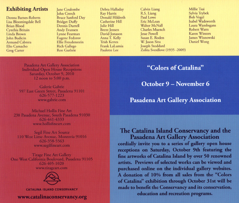
Colors of Catalina Show

The Colors of Catalina Show . Pasadena, CA Oct. 9 - Nov 6 2010
Artists who are in the 4 galleries that comprise the Pasadena Art Gallery Association were asked this last summer to travel over to Catalina island to paint scenes for a show benefitting the Catalina Island Conservancy. I am very fortunate to belong to Galerie Gabrie and headed over to the island with my painter friend Rich Gallego. We were asked to paint the flowers in bloom but we probably missed that by a few weeks since Catalina islands' spring bloom doesn't last very long. We were left with rolling hills surrounded by blue pacific waters. I did however find some gold carpeted flowers and painted away for 2 days.

Rich and I painted the first day together up in the hills near the island airport which was built by Wrigely...of Wrigley's gum fame. The second day we split up, I headed for more flowers near the Wrigley botanical gardens and Rich painted the pier in Avalon harbor. Aside from painting Rich and I had some great Mexican food, plenty of art talk and checked out some of the local artists work scattered in venues throughout the city. The tiny town of Avalon is very cool to stroll around. Our hotel was right in front of the Conservancy bus stop so transportation up to the airport was a breeze.

Rich's gallery, Segal Fine Art, is having their show right now and ends around Oct 9th I think. Galerie Gabrie will have their show with the October dates above. If you can get to Galerie Gabrie in Pasadena it will be worth the trip.
Galerie Gabrie, 597 East Green St. Pasadena CA Phone - 626-577-1223
Open Tuesday through Saturday 10:30- 5pm


Avalon Harbor, Catalina Island

Saturday, September 18, 2010

Yellow Moon


"Yellow Moon"
12"x16" Oil on Canvas


Just finished this one up. I wanted that background very pale and boy did I get it, hahaha. This painting was done more to see how this scene would look should I choose to go larger. I had the idea for a very late afternoon scene with the moon rising. I tried to keep the moon very pale so there isn't much contrast with the sky as you can see. The painting is still sitting on my easel and the moon works better here. The photo seems to reduce what contrast there is. I tried to add contrast but then the trees start getting pretty dark...more than what's in the painting so I opted for not messing with the contrast.

Overall, I like the results and will more than likely go larger with this one soon. I'll probably add a bit more dark to my sky to increase that contrast with the moon but as it is I'm pretty happy.

Monday, September 13, 2010

Rancho San Carlos de Jonata

"Oaks At Rancho San Carlos de Jonata"
15" X 30" Oil on Canvas


I was very fortunate to be invited to visit and take reference photos of this Ranch. This is one of the "Old California" Ranchos handed to prominate Mexican Citizens and this rancho was given from Governer Pio Pico to Joaquin Carrillo and his brother in law Jose Maria Covarrubias. Early Ranchos were used to settle California and raising cattle was the main business at many of the Ranchos. In the 1840's there were so many cattle that travellers were allowed to slaughter a cow for a meal. The cattles hides and tallow were probably more important than the meat of the cow at the time...in fact hides were considered "California bank notes" and used as currency until the gold rush came along.
Over time the original Rancho was sold off, split up and the land handed down to new heirs. Part of it, about 9000 acres, became the town of Solvang. There were 3 founding members of the Danish American Colony Company who founded Solvang and one of them is the relative of the man who now owns a large piece of the original Rancho de Jonata. He and his wife are really great people and love to paint too.


I tried to capture this view looking east across the Santa Ynez valley to show the vastness of the land and rolling hills of the valley. It's a midday scene and has that sun drenched feel to it. Below is a shot of the painting progressing. I have laid in my darks for the trees in the foreground and was at this point putting in the mid greens in this area.


Saturday, September 04, 2010

Foxen Canyon Oaks


"Foxen Canyon Oaks"
20" X 30" Oil on Canvas

This painting is just abouyt finished. I'm going to let it sit and ponder it for the next few days while starting another painting. It's late and I photographed it which for some reason the late pics never seem to come off good. The original painting is here and has a really decent look to it but for some reason some of that is getting lost in the photo. I'm really too tired to mess with it though and at this point I want to move on to the next painting instead of messing with taking a better pic.

I had a great frame that was custom made to this size of the painting a few years ago. I had painted a vineyard scene but it wasn't my favorite vineyard scene so the painting ended up in my bedroom against the wall. I decided to quit wasting the frame and took the painting off of the stretcher bars. I restretched new primed canvas over the bars and painted this scene. I rolled the old painting up and stached it in the "art" closet, a 5'x8' room I use to keep all of the art materials, packaging, prints, frames and old paintings in. I think this one will work just fine in the frame. Dying to see what the varnish does for it.

It's been hot here the past week and the studio is too warm to paint in. I have an air conditioner but hate running it all day due to the cost it adds to the monthly electric bill....also it is only a few feet from my easel so it is kind of loud. Most of the year the studio works fine but when it gets hot half of the day gets pretty toasty in here....come on Fall!

Thursday, August 26, 2010

Oak At Nipomo


"Oak At Nipomo"
15" X 30" Oil on Canvas
I had a painting at a benefit show to help raise funds to restore the Dana Adobe in Nipomo a few months back. While there I took some reference photos and did a plein air painting. The adobe is on a long dead end street and this oak tree is on the property next to the adobe. It's a huge tree that has to be tens and tens of years old with a great spot overlooking the farmlands of Nipomo. Always a sucker for a good looking tree I wanted to paint it so that's what I did.

The interesting thing about this painting is that I ended up really working hard to paint better grasses and the smaller plants in the foreground. Had I painted my usual grasses I would have had this done in 2 days instead of the 3 that it took to complete. I've been admiring the way Clyde Aspevig paints his foregrounds grasses. I stared at his for a good few hours and thought I needed to work more on mine instead of doing my usual "flick of the wrist" grasses that I normally do. Mine are ok but they probably needed to evolve some more. I don't usually paint many small bushes either so that was something I wanted to work more into this painting. I like Clydes grasses but he attains a much more realistic look than I do or can do at this point. That guy sure can paint small plants though...makes me drool.

Monday, August 23, 2010

Showtime....


Entry way into the show. This doorway thing is actually there all of the time. Worked for us though.
I'm really out of shape when it comes to spending a day doing a show....an outdoor show. The show was yesterday and I was dead when I got home. What's worse is I woke up feeling as if I had a hangover and I didn't drink a beer all day. My problem was I only slept 3 hours the night before the show getting ready. Nerves and last minute changes I guess....well, mostly changes. As for the show well, they don't go over well in a bad economy. We did a heroic effort at putting on the show...lots of planning and losts of work. It looked great and came off very smoothly considering this was the first effort of a show by this group here in Los Olivos. I've been to worse shows that had been going on for years. This one was first rate. The problem was that buyers were in short supply. People spending $20 or $30 for jewelry or small crafty items but barely any on paintings. We had groups of artists in 4 locations throughout the town. In our group only 3 small paintings sold...in the group across the street only 1 sold. I don't know about the others but I've heard it wasn't any better. I managed to only sell a couple of books. Ho hum and ---- this economy. Sorry but it's starting to piss me off.
There is always good news and that is we had awesome compliments on my work. We had a hugh number of "lookers'' walk through our canopy and lots of great comments. We had a lady show up who came to see my work and she drove all the way from Palm Desert! That's half way across California. She saw my work online and told me she had to see it in person and she loved it. That was very cool. She bought a book and said she would go see more of my work at the gallery. I love people like that.
I suppose I could be more mad at no art sales but honestly I know I'm doing my best work to date and this economy is killing everyone around here. We made a very good presentation in the booth and I'm always good with the visitors. Come November maybe things will get better....VOTE!
Here are some pics of the day.....

My canopy , above and below, which looked pretty good out there.

As you can see the whole event looked good and there was some outstanding art there. This was Jim Woodark and Richard Rice's setups. Killer work from both artists.
This potter set up next to me and she sold about 7 or 8 pieces by the end of the day. I think her mugs were about $20. Very cool work. She does shows about once a week and told me this summer has been very good for her....so maybe pottery classes are in my future....or jewelry making. Actually those 2 types of items always sell at fairs.


The tire planters were interesting but I think they went home with a big zero too. Nice couple and you had to give them an "A" for effort. I'd have given everyone that same A because all of the artists had good looking work...well, except for one guy. He was juried in with some female portraits but showed up with total nudes that looked as if they were posed by girls out of playboy...too funny. I should have gotten pics of that but I'm sure Linda would have kicked my butt if she saw me with the camera heading over to his booth.


There were many types of art...probably too many. I wasn't crazy about the artists being split up over the town and there were a lot of distractions. We had a paint-out down in the center of town, some things going on in other parts of town, bands, pay areas setup...things I don't normally see at shows. I've sold more at smaller shows but that was when we had an economy to speak of. This was in August too... you know, hot August, so it was a bit too warm for a lot of people. Still everyone gave it their best shot. Win some, lose some. Outdoor shows are like shooting craps no matter what the situation is like, sometimes you sell and sometimes you just go home tired.

Now that this show is over I have a renewed urgency to paint new work for the upcoming Studio Tour in November. I also have a show in October but that is a low keyed show where I don't need to be there. I'm itching to do some new work to replace old ones I've looked at too long over the year. New ideas and you know what the wiseman says...when sales are slow paint your butt off because you'll need a backlog of work when it picks up. Zoom!

Wednesday, August 18, 2010

Artist Canopy Sign

I am waiting on some small paintings to dry up a bit from varnishing at the last minute so I thought I'd post some of the progress of readying for the show this weekend.
My old sign for the canopy was falling apart. I need to break down and buy one of those fancy ones that are hung across the top of your canopy for shows. I have always got a reason to not do it and everytime a show comes up the sign issue comes up...procrastination at it's best. I was recently at an artists studio as she was having a sale on a lot of her equipment due to her moving back to Canada. She gave me some stretcher bars so I decided to just make a sign since time was short. I wanted a tall sign to fit one of the grids we use to put out front and somehow get my name out there. I used part of the composition from the small painting I had done in the below post titled "Evening Approach". I just added a bit more green to the tree and left an area up top for my name. When the painting and the top area were dry enough I used a projector to place the lettering that was printed on a small sheet of paper. I traced the letters and then put the canvas back on the easel and painted in the letters....I'm no sign painter like my uncle who would do something like this freehanded and it would look perfect. He's a sign painter...I paint letters.

Anyway...while that all was drying I made a frame for it out of a scrap 2x4 I had in the garage. I would like to have used oak but that meant a 30 mile trip to Home Depot so instead I opted for the fir 2x4. Here is what the sign will look like hung in place. We adjusted the floor plann of the booth for the show...see, this is why you put the booth up ahead of time to tweak it to what you want for a particular show....looks cool!!

Saturday, August 14, 2010

Distant Hills


"Evening Approach"
5" x 7" Oil on panel
SOLD
Did this painting to work on the colors and atmosphere you see of distant mountains in evening light. I like playing with those distant highlights on the mountainsides as they collect the last rays of sun. I used an old tube of Shiva Cadmium Orange to do the trees. This tube is one I've had since college in the early 80's. That old tube was more than half full and beautiful color still! I miss Shiva paints. Had to pick that up at the Standard Brands art section right there on Fair Oaks in Pasadena long before it closed it's doors. I think this painting has some great color in it and a nice sense of mood...I'm happy with it.

The Canopy

It's time to get out ye old artist canopy for an upcoming art show next week. There is going to be a huge art show in the small town of Los Olivos with artists from all over the Central Coast participating. 10 AM to 4PM on Saturday the 21st. Click the highlight above to see the other artists and get more info. I'll be on the north end of town in Saarloos Park close to the food booth, hahaha.

We set the canopy up in the back part of our yard to dial things in for this show. I will have some really small paintings as well as the big ones to show so I need to make a display section for that. It's getting late in the game and I am also working on a new sign for the canopy. The vinyl letters on the old one are finally peeling after 5 years. It looks pretty blah here but wait till it's loaded with art and signage up...it will look cool then.

Tuesday, August 03, 2010

Santa Ynez Rolling Hills


"At The Foothills"
24" X 36" Oil on Canvas
Finished this one up right before my trip to Oregon. There are so many things going on right now it took me a while to get somewhat caught up enough to post anything here. Sales are still super slow but you still need to keep moving and trying things. I like this scene and have painted similar scenes from the evening I spent here taking reference photos. These colors are so typical of this area...in fact, a lot of the California landscape looks like this. The warm ochre tones and rich dark greens of the oaks are hard to ignore for an artist. Most of this land is used for grazing cattle by the Chamberlin Ranch here in Santa Ynez.