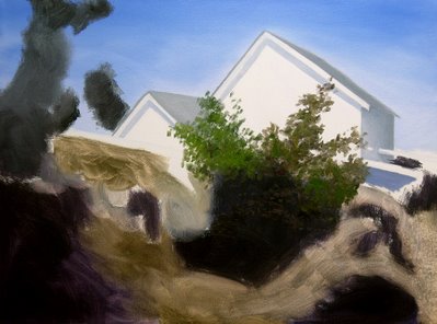
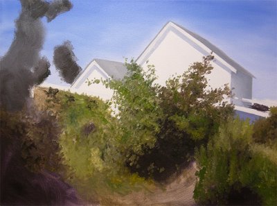
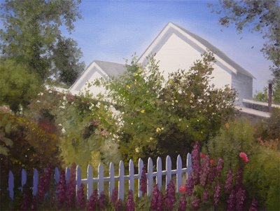
I also snapped a few pics of the progress on this one. To check my memory, and for fun, I decided to move the smaller painting inside the house and not use it for reference in doing the larger painting. I painted the larger version using only my original reference photo like on the first version. My results were pretty dang close to the smaller painting.
Here you see the start of the painting....sky first then the added houses. After that I used a thinned paint and, using a paper towel, simply rubbed in the dark blocked in areas of foliage. Some for the dark shadows and some just for an underpaint of foliage where the leaves would be painted in as just mid and highlighted values. I never actually paint "leaves"...they are just suggested masses of paint. These rubbed in areas of paint are a mix of the color of paint you want to use and then dipping a paper towel into turpentine, dipping that into the paint mixture and rubbing away. The nice thing about this method to get these areas done first is that the turpentine causes the paint to set up to a tacky finish in just a few minutes when the turpentine dries. This allows you to paint your mid and highlights right after it dries. I move to other areas to give it some added drying time and then go back to these areas. Looks horrible but it works.

Here you can see the added foliage being painted in over the rubbed in areas. I'm a lefty so I tend to paint from right to left across the canvas. Being a large canvas and using small Flats this process took a few hours.....

Here you see most of the foliage added. I've layed in the cool whites of the fence. This is just Ultramarine Blue added to Titanium White. To the left I increased the blue to darken the fence in the corner of the painting. I thought the fence posts were too narrow so I widened them right after this photo was taken....made a big difference. My perspective was thrown a bit working on the larger canvas. I'll add the white highlights of the fence next which will finish forming the fence....
Finally, the finished painting after lots of tweaking here and there. Overall, a close resemblance to the first smaller painting but some noticable differences. I'll try and get the gallery I'm in to take this piece and use the smaller piece for showing at local Artist Guild shows.

2 comments:
Great demo! Thanks!
Saw your work on wet canvas.
nice blog!
Hi Virginia, Thanks for checking out the Blog and enjoying the demo. This was a fun painting to do...so much I did it twice! hahaha.
Post a Comment