Friday, November 15, 2013

Foothills Above Santa Barbara

"Foothills Above Santa Barbara...1999"
16"x20" Oil on Canvas

"Foothills Above Santa Barbara...2013"
16"x20" Oil on canvas

I painted the first version of this painting in 1999. I thought I was done at that point. I never varnished it after it had dried because the more I looked at it the more I felt it just didn't feel finished. Late last year I put it back on the easel and made lots of changes. I added the larger trees in the mid ground and totally revamped the foreground. I also added more rocks in the mountains. It sat drying once again but still I felt it was missing something. I decided to go at it once more and make more subtle changes to the foreground  especially the flowers. I touched up the trees with branches and added twigs and smaller branches to areas of the bushes. At this point I'm calling it finished for good because it now feels finished.
The upper photo is very much like the scene actually looked. I wanted those dark shaodws of the mountains and probably overlooked the rather mundane mid and foregrounds of the original scene. What I added and changed was out of my head but I think adds more interest. Switching the point of interest from the mountain shadows to the trees was better for the painting regardless of the accuracy of the scene. I still see what I liked in those dark shadows along the mountains, they now add to the total painting. I think that had I not added the tall trees and just revamped mid and foreground colors, flowers and grasses it might have worked that way too forcusing on the mountains again....hmmm, idea for another painting.   

Tuesday, November 05, 2013

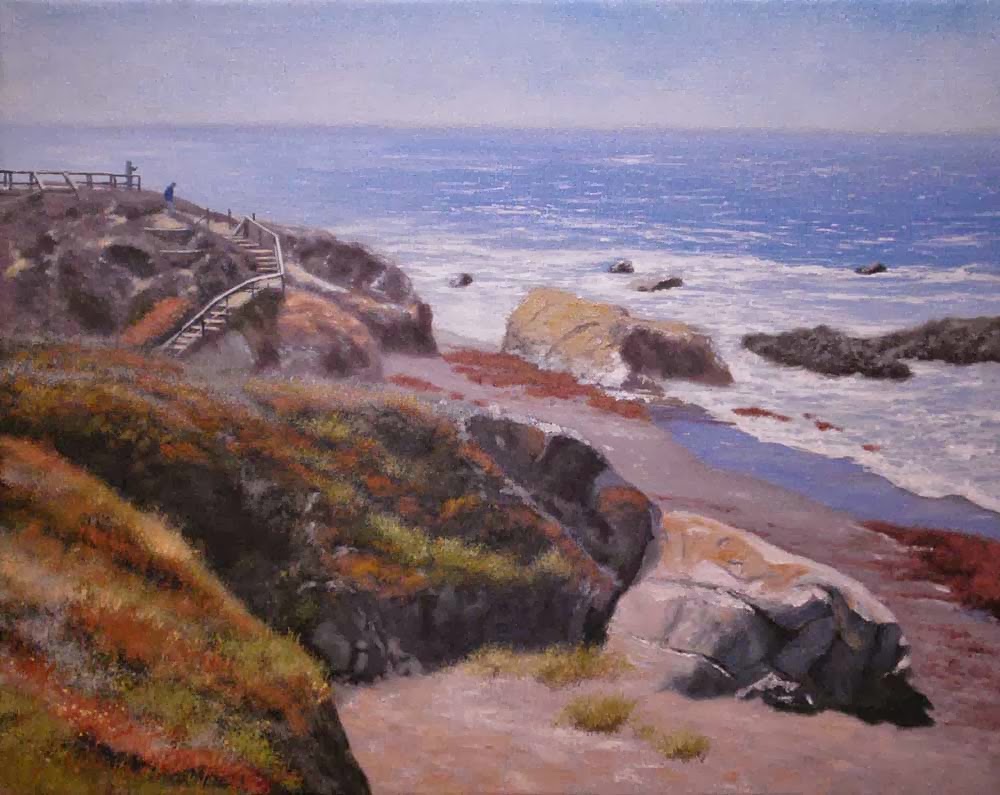
Surf At Morning

"Surf At Morning"
12" x 16" Oil on Canvas covered MDF Panel

I am again painting coastal rocks in the surf with this painting. I like the flattend foam patterns in the water as well as trying to improve my work on rocks. These rocks had those striated pattenrs in them which gave them that yellow/orange line of color adding interest to the normally dark rocks. I also liked the shadows across the foam on the rocks too. In the actual painting it is easy to see that the color of those shadows is a light violet and against the stark white of the foam in the sunlight it makes for a great contrast.
The brown sandy bottom and churned up sand in the shallow foreground area gave tge water that murky look...almost resembles muddy water...it's a big contrast from the silvery sheen on the top of the water right below the incoming wave. 
One thing I love about painting water, any water, is that at first you are only laying in base colors and it looks horrible. Then you begin to add reflected colors and shadow on top of that and it really is amazing to see it turn into water. The answer to painting good water is reflected color....but it is only going to work well when you paint a good base color. What is the base color? It is usually the color of what is under the water....the bottom, since water is clear, colorless. The deeper the water gets then you begin to lose the light which makes your base color become dark blue, light blue, green etc. You can learn a lot on how to paint water just by looking at a photograph of it. When it's moving it is harder to read but a still photograph makes it easy to dissasemble the parts of the water in your artistic mind. You'll see the base color and then the reflected colors on top of that. Sky, clouds, the far shoreline, docks, boats, rocks, these are your reflected colors. The less the water is disturbed by wave action the more reflected color you will have. 
....a detail of the foreground rocks and water


Saturday, November 02, 2013

Resurgence & Ecologist

    I've received my copy of the November/December 2013 issue #281 of Resurgence & Ecologist magazine. This magazine is an English publication that covers ecology, social justice, activism, arts and ethical living. I was approached by the magazine to use an image of one of my paintings to go along with a story written titled "Urban Zoology" by freelance writer Mary Ann Lieser. Mrs. Lieser's story of wildlife seen on her pre-dawn 5 mile walks had won a 2013 Nature Writing contest by the magazine. In the story Lieser describes encounters with grazing deer along her urban Ohio environment so my painting seemed appropriate.
    I stopped my truck to take the reference photo of that deer crossing the road. He froze and just watched me take the photo. Around that turn behind him is Hwy 154 heading into Santa Barbara. We have deer everywhere where I live. They walk into our yard and eat the leaves off of our apple trees, roses, asian pear tree and apricot trees. One time when putting the trash out after dinner I heard this clacking sound and one was hopping (prancing) up our street in front of our driveway. Another time I walked out of the door to the studio and 2 deer stood 6 feet away from me in the driveway. They darted away and I almost fell backward into the door not realising they were deer and not Big Foot...hey, it was almost dark. If you ever get a good look at a deers legs you wouldn't believe how something so thin can lift that animal over a 6 foot fence in a single hop. They really are amazing animals.
Thank you Emma Cocker and the rest at Resurgence & Ecologist Magazine...and nice story Mary Ann Lieser.       

Tuesday, October 29, 2013

Morning Rocks

"Morning Rocks on the Coast"
12" x 16" Oil on Canvas covered MDF panel

I've been enjoying painting coastal scenes lately. I really like painting the water but painting bluffs and rocks along the shore is such a challenge, a fun challenge. I don't know what it is about rocks but at times they seem to be really hard for me but other times they fall together almost on their own. I'm learning that with rocks "less is more...always". Seems the less finessing of brushwork makes for better rocks. A little knife, some slapping paint in with the side of the brush and bang! Rocks. Whenever I labor over them to make them look "right" they never do. Maybe I'm just expecting too much working like that. When I work the faster slam-bang method I'm happier with my results.
The one thing I did do on these rocks were to play with edge variation...keeping some edges loose and painterly and other edges sharper....some with knife and some with the softer brush edges. I'm happy as a clam with all of that. Fun stuff!
A detail showing some edgework....


Tuesday, October 15, 2013

Cambria Seascape Demo

Thought I'd post this one as a demo if it worked out in the end....yes, I'm not one to post a demo that goes south, haha. This scene is of an area south of Moonstone Beach, Lampton Cliffs to be exact...the edge of that bluff you see to the top left is actually the beginning of the old Harper Sibley Ranch which is now known as the Rancho Marino.
Off to the demo.....

This is the initial sketch, kept very simple and used as just a guide for where things will go...and that's always negotiable as the painting progresses. 

After the sketch blocking in colors will begin. Took me a while to understand the importance of blocking in colors as a method of painting certain paintings. I only do it with about half of my landscapes I think. For more complicated paintings blocking in seems to be the best way to do it....especially for water. After I took this picture I went back in and readjusted the colors of the water in the foreground...that green tint was too light. I discovered that only by beginning to paint in the other colors over the top of that green tint...sometimes you just can't judge a color without something to reference it by.

After the block in of colors, I call them base colors, I started painting in the details which really is the hard work to the painting. I started with my foreground water, into the background water. then rocks working from the front back. This stage takes the longest time. The previous two steps are done quickly because most of the time on the painting will be spent right here...painting, tweaking, tweaking, tweaking and add too the mileage you will rack up walking to the other side of the studio to take a look from a distance, smile or frown, and back to the easel to tweak some more.
 
Finally, the last stage is making small adjustments to the entire painting until you feel it is done. Each artist has to make that call. When I can't seem to make any more brushstrokes that make sense in making it better I stop. Hopefully at that point Linda won't walk in an say "shouldn't the water be more blue???" Ugh!"
"Cambria Coastline"
20" x 24" 
Oil on canvas

Sunday, October 06, 2013

Moonstone Beach Boardwalk

"Moonstone Beach Boardwalk"
16" X 20 Oil on Canvas

This one is just about finished. I saw this great scene while on a visit to Cambria. There is a boardwalk they have built there and this painting came from one of my reference photos. I only had about an hour to be in Cambria so I snapped shots as fast as I could. It gets cold up there and my lens was getting fogged up once outside for long. Great place to be though and one of these days I'm going to go up and stay overnight.

This photo of the painting isn't as good as I wish. My camera always picks up certain colors. On this one it decided to pick up the bright reds...they really are not bright at all on the painting. They are more subdued but in this photo they get overemphasized. The water came out great I think. The photo doesn't really show that well but on the painting it looks really good. There are subtle shifts in the blues of the shallow water and the water heading out to sea. Also, the distant water has these nice bits of white caps you can't make out here. It seems anything larger than 16x20 tends to not work as well with my camera. Of course, it is only 6 megapixels so one day a larger megapixel camera will be in order.  

Friday, October 04, 2013

Into the Magazine It Goes

"Deer Crossing"
12"x16" Oil on Panel
I couple of weeks ago I was contacted by a person working at a magazine in England asking if I'd be willing to allow them to use my painting "Deer Crossing" for an upcoming issue. The Magazine is called Resurgence and Ecologist and has been published since 1966. The magazine deals with environmental issues, art philosophy, sustained living and more. I've checked out the magazine and also watched a pretty cool video made for their 45 year anniversary of the magazine. What an honor it is to be included in one of their issues. I received an email this morning that the painting had made it into one of the upcoming issues and they are going to send me a copy. I was pretty delighted about that.     

Wednesday, October 02, 2013

Cambria Surf

 "Cambria Surf"
20"x 24" Oil on Canvas

On Thursday our modem died on us. Of course, we didn't know it was the modem for at least a day of checking other things first. During a test with the phone guy he decided our modem was too old and he'd send us a new one. By Sunday I couldn't take waiting any longer and we just bought one to get back online. I hated using my phone to check my email and not being able to post with easy from using my desktop computer....the new modem arrived yesterday of course so it is now my spare.

While all of that was going on I was doing some research into painting more marine scenes. I've done them in the past but it is good to read and check out images online to try and improve ones work. The scene above incorporated some things I hadn't tried yet and I consider it like all other paintings as another step towards being a better painter. I'm really not finished with this one yet. I was to glaze the background to push the distance and ad some haze to the bluffs and rocky waters. I was going to paint that in but I hadn't glazed in a while and glazing is fun...well, waiting to glaze isn't fun, I actually hate waiting for the paint to dry enough to glaze. The thing about glazing is brushing on the glaze and watching the background develop into what you want it too with each pass of glazing....fun stuff!

Speaking of marine paintings.....when I was stationed in Germany I acquired a book by a well known marine painter. In this book were the most awesome depictions of water I've ever scene. The trouble is to this day I cannot remember the artists name. Yes, I've already hunted all over for his work online but have never seen any. He did a lot of merchant marine ships in East coast harbors such as NY. One of these days I will stumble across his work I'm sure....you can't paint that well and not be well known.    

Sunday, September 08, 2013

123 Tree! Demo

                  Detail of a painting from 2010
There, a eucalyptus tree. Well, the way I like to paint them right now anyway which is not to say you can't paint them any other way. I'm still evolving with my trees with each painting too. This demo I took from a painting done in 2010, and sold to a good friend here in the valley, shows basically a 3 step process I use quite often for trees.

Step One....the basic tree shape is blocked in with the dark shadowed colors. I like to use a mix of ultramarine blue, alizarin crimson and just a slight bit of cad yellow light or pale. for this reddish dark color it would be like UB 40%, AC 55% and CY 5%.  I always throw in a bit of cad yellow. The more cad yellow you add the greener it becomes.  Try to paint the darks of the tree as thin as possible so the paint can tack up some. If you are working alla prima then try and paint just the areas where the darks will be seen and leave other areas for the lighter colors.

Step Two....you can do this 2 ways. Add a lot more cad yellow to make a lighter mid value green out of your dark mix or just mix up a new batch of mid value greens. I do it both ways. If I am adding to my dark mix I try and save some of the dark mix for later touch ups if needed. Work from the top down and let the dark colors blend into the mid value mix. This fades the light colors into the lower areas of the tree and the shadowed side of the tree.

Step Three....either add more cad yellow to your mix or mix up a brighter yellow/green for your highlights. This is added just where the sun is really hitting the tree. I like to add some yellow ochre too in spots. Yellow ochre gives you that great olive drab color which is perfect for oaks and eucalytpus trees.
 Lastly, I add the trunks using pinkish whites, greys, tans or even light pale blues. At the tops of the trunks I add a little more ultramarine blue to give them shadows as they disappear under the foliage. Gives the trunks a nice realistic look and sense of tree shape....branches causing shadows. Also, add skyholes. Trees are rarely solid masses except in the distant background trees and at times they even have some skyholes. I always save some of my sky colors just for this purpose. Shape your skyholes to line up with some of the trunks to make the trunks believable. Actually, you are creating shadowed trunks and branches with the skyholes. Just imagine the trunk or branch shape and paint one side of the skyhole and then the other leaving the dark trunk or branch in between them. What then appears as trunks or branches are actually just your darks of the tree that you painted in Step One. It's all an illusion that makes sense once the painting is finished.

There are many ways to paint trees. There are many color palettes and paint combinations you can use. A popular one to use is blue or even dark green shadows....cool colors. I've done those too if I'm not using a warm color like my dark red here. They say there are no rules in art right so you could use any color you wanted as long as it is dark....I tend to use the reds, blues and greens depending on my overall palette of the painting. My foreground grasses in this painting were warm ochres so I went with warm shadows. Had the grasses been spring or winter greens I'd go with cooler shadows like green or blues. This is in keeping with the color harmony working in a painting. Whatever dark you use make sure your other colors have just a hint of it in them to work the color harmony.  Dark grey shadows...mix grey greens for mid values and lighters greys to your highlights....it's possible, anything is possible when you paint.   
        

Tuesday, August 13, 2013

Painting and Pen & Ink

Before I painted I used to work mainly with the pen & ink medium. I was fond of the stippling technique and most of my drawings were large pieces...up to 18"x24". That's kind of an insane size to work with considering the small pen nib sizes I used. Stippling is the process of applying single dots of ink one at a time with a Koh In Noor Rapidograph pen. The ink work is usually done over lightly drawn pencil lines used as the guide for the artist to follow. I enjoyed pen & ink work. It's hard on my eyes now but I've loggged thousands of hours dotting away quite happily.

The effect of stippling is much like printed images you see in the newspaper....halftone images, a reprographic printing process, is simply an image being formed by dots of ink creating toned images which I call value images. If you want to better the values in your painting do pen & ink work...you'll see values easily after that.

When I started with pen & ink there were not a lot of art instruction books out there for it. Wanting better compositions I turned to reading painting books. Composition is composition so it worked for me. As for colors you just insert values. One thing about your point of interest is putting it in the right place and then directing the eye there. I had a drawing of a boat that really illustrated this point well.

Here is the initial point of beginning the drawing. Tha man working on the boat was my point of interest. That area should have the darkest darks and lightest lights.
 Continuing on, I began to fill in the rear elements and foreground area....keeping the foreground boat just a bit lighter in value.
Now it was time to finish up and adjust things along the way. You can see how the dark line of the rubber bumper leads right to the figure. The dark edge line of the shadow in the water leads to the figure as well as the nonskid deck surface doing the same. These linear paths leading to the figure help to establish the point of interest. The values kept stronger and darker in the area of the figure draw the eye there to to discover that man working. The foreground boat would normally have the stronger darks and lights but for this drawing with a midground POI the values were kept much lighter in the foreground. It worked.  
You can get very nice control of your values using rapidgraph pens...these are technical ink pens that can be reloaded and used over and over. Many artists today are now using throw away type pens since we now live in that state of mind. Good ones to buy for that are Pygma Micron pens which have acid free archival inks.
My favorite pen....Koh In Noor's Rapidograph which comes in different pen sizes and are refillable.


Thursday, July 25, 2013

Goodbye Mr Guthrie

Leon Guthrie and me....
I've put art aside for a while because my heart really isn't into it at the moment. My Dad passed away peacefully from cancer a few weeks ago. My Dad lived a long good life. Like any son I can say my Dad meant the world to me and guided my life. My Dad provided for me as a child and was there for me when I became a man and ran into life's curveballs. My Dad believed in my art and helped me to love working with wood as much as he did. My Dad taught me how to appreciate Big Band music as well as Country music. My Dad came from humble beginnings and lived a humble life. Although my Dad never served in the military he appreciated that I did and was proud of me.
My Dad sort of forced me into playing football. He told me either I play or he was going to take me to the barber and get my hair cut. I signed on to play and they cut my hair anyway. My Dad was also clever. I now, and forever, was glad I played football. My Dad was wise.
My Dad made sure that 8 kids had a home to grow up in. He got them through school, sports, took them camping, fishing and fed them. My Dad did all of this and a lot more by simply going to work everyday and being there for all of us.
Later in my life I was going through my divorce and my Dad was there for me. 
I'm fortunate that I wasn't a kid who didn't get along with his Dad. I talked countless hours with my Dad over the years and was always amazed at how much he knew. I was handed down my Dad's wood working tools and will think of him everytime I walk into the garage...that of course will be when I'm not busy thinking of him all the rest of the day. Good work Leon.    

Friday, July 19, 2013

US Coast Guard Art Exhibit - Coos Bay

My painting above will be part of the US Coast Guard Art Exhibit at the Coos Art Museum in Coos Bay Oregon. This show will feature 18 COGAP artists and 12 of the artists are members of COGAP from the west coast. COGAP, US Coast Guard Art Program, is comprised of many professional juried artists living across the US who donate their work to the program to show the various missions performed by the US Coast Guard.

The Coos Art Museum is a great looking museum and has many diverse shows throughout the year. I strongly urge any of you that can get to the museum to stop by and see this show. 
Show Date - Aug 3 to Oct 5, 2013.

235 Anderson Ave. Coos Bay, Oregon
(541) 267-3901 

Tuesday, June 04, 2013

Waterscapes, California Art Club Show

"Waterscapes", is the current running California Art Club show at the beautiful Altadena Town & Country Club. This show will run from May 24 till September 17. June 6th from 6-8pm is the Artists Reception. I was fortunate enough to have my painting, "Stream In The Arroyo", juried into this show. Yahoo! There looks to be some seriously good pieces of work in this show so if you are close to Pasadena please try and go see the exhibit.
The Altadena Town & Country Club, 2290 Country Club Drive, Altadena, CA  

Santa Barbara Show Extended

"Eaton Canyon Fall"
20" X 24" Oil on Canvas

The "Shared Visions" show at the Divine Inspirations Gallery in Santa Barbara has been extended until July. This is a PACC members show and all of the artists have brought in new pieces to spruce up the already great looking show. If you are in the Santa Barbara, CA. area please try and drop by the gallery to see the exhibit. This is a great looking show by the members of PACC.
1528 State Street, Santa Barbara, CA.
805-962-6444

Sunday, June 02, 2013

"Young Mission Olives"
12"x16" Oil on Panel

Another one from the Santa Inez mission paintings. This one painted while we still had a bit of Spring lingering around the valley. These trees are young trees so they don't have the typical look of olive trees seen in most paintings. I painted them young as a matter of record. One day the olive trees will be mature trees being picked every season and I'll paint them again as a matter of record. The fun part of these paintings were painting in the mission on the bluff. From this angle you can't see the parking lot in front of the mission so it has that old look and feel to it. 

Saturday, April 20, 2013

Mission Santa Inez Olives Paint Out

Had a lot of fun painting down at Mission Santa Inez today. I arrived around 8:30 and met up with the other 4 artists from the show at the Elverhoj Museum to paint the mission olive grove....or any other scene we wanted to do. Eventually we had about 16 or more artists painting for the day so that was a lot of fun. I was surprised that all of the green grass that was here a few weeks ago was now long gone and replaced by summer colors. I wanted green for the mission painting. You can see from above that I went with the summer colors while I was there but I think I like a painting I did this past week in the studio with green grasses.
I had done another painting with green grasses from a reference photo taken a few weeks ago that was very similar to this so it was still in my mind.
Linda came down with some lunch for me so that was cool. She got to be cameraman while I painted. Lots of bugs down there landing on the painting but no biggie. I think painting later in the afternoon would have worked better since the winds kicked up and it got much cooler....plus the light is better then. 
All in all we had a lot of fun but it got hot around midday. I was ready to head home by then. We all ate our lunches and joked and then headed out. Here are some pics of the day....


Thursday, April 18, 2013

Santa Maria Path

"Santa Maria Path"
16"x20" Oil on Canvas
I got the idea for painting this scene when I had to go up to Santa Maria for a physical. I'd been there before and know that the clinic is right across the way from the Santa Maria airport. There are wide expanses of fields there with large eucalyptus trees. This scene here is looking away from the parking lot of the air museum there. There is a road that crosses where the path winds into the distance behind the foreground trees but I left it out since it doesn't add to the scene, just crosses the field back there. I liked this scene for the strong contrast between the distant trees and the foreground trees. This painting was done alla prima which means in one sitting. Really fun painting.
A detail of the tree in the foreground......


Friday, April 12, 2013

Mission Santa Inez Paint Out Event


Would You Like To Paint ???

Artists invited to “Paint Out”
at Santa Inés Mission Mills complex on April 20
Elverhoj Museum of History and Art invites artists of all mediums to bring their art materials for a “Paint Out” at the historic Santa Inés Mission Mills complex on Saturday April 20, 9:00am to noon. This is a special opportunity to learn about the history of the site, meet area artists, and document the beautiful site located below the Santa Inés Mission.

Artists are invited to sketch, paint, make a color study or photograph the site for future work. An optional brown bag lunch and discussion will follow the Paint Out.

Artists Peggy Brierton, Ron Guthrie, Renee Kelleher and Carol Wood will be working on site and offering their support and guidance upon request. Each of these four accomplished local artists displays their diverse visions of the Santa Ynez Valley in the current Elverhoj exhibition, “The View From Here.”

The property is part of the Mission Santa Inés National Historic Landmark District and includes olive groves, an historic grist mill, a fulling mill, and the beautiful Alamo Pintado Creek corridor with the Santa Ynez Mountains as a backdrop and the Mission in the distance. “With wildflowers dotting the olive groves, this historic site is an artist’s paradise in the spring.” says Elverhoj Executive Director Esther Jacobsen Bates. “And as Aldous Huxley wrote, ‘The olive is essentially a painter’s tree.’” 

The Santa Barbara Trust for Historic Preservation (SBTHP) manages the 39 acre property on behalf of the California State Parks and is in the process of developing a public use plan. The Paint Out is a collaboration between The Trust and Elverhoj.

The Mills property will be the subject of an upcoming juried art exhibition at Elverhoj. An open call for entries and exhibition specifics will be released in early summer. Interested artists can email info@elverhoj.org to be added to the list to receive a prospectus and entry form.

The Paint Out is free for Elverhoj members, $10 for non-members. Reservations can be made by phoning Elverhoj at 686-1211, or via email to info@elverhoj.org.

Sunday, April 07, 2013

Imagine That!

Above is an image of a plastic model of a WW2 ship. When I was growing up I built dozens of models...the USS Franklin, Titanic, Queen Mary, P51's, P47's, P40's, B17's, B24's, B25's, Lancasters, F4F Phantoms, Sabres, the Saturn 5 rocket (a 5 ft tall model!)....not in a million years would I have ever guessed that one day one of my paintings would be displayed on board one of these ships...in real life! But low and behold, yesterday I received an email from the Coast Guard of what paintings in the collection would be displayed during the 2013 year. One of my paintings titled "Capsized" is going to be displayed aboard the USS Yorktown which is now a museum in Charleston Harbor, South Carolina from the later part of May till the early part of June in conjunction with the Spoletto Festival activities.
....And can it get any better than that? But of course! Turns out that Linda's Dad served aboard the USS Yorktown when he was in the Navy. Sometimes it is really cool being an artist. 

The 4 paintings that were juried into the Coast Guard Art Collection this year will be on display at the Salmagundi Club in New York May 26 through June 14 as part of the Inaugural Exhibit.

Another painting of mine, "Surf Training", will be part of a show at the Coos Art Museum, Coos Bay Oregon,  August 2 through September 28, 2013. Yahoooooooo!

Saturday, April 06, 2013

Shared Visions Show Reception

Sometimes a show reception can just go bad from the beginning! Well, not really the show reception. The show reception down in Santa Barbara was beautiful. It was held on Santa Barbara's First Thursday Art Night so that meant a lot of people would be coming to the gallery...and they did. The Divine Inspirations gallery was pretty much packed all night. As you can from above I took my camera to take a few pics but most of the shots are horrible because there were just too many people to shoot a good pic. No, what went wrong was with me.
On monday morning after hanging the show I was driving back home and could feel myself coming down with a cold. By tuesday I had chest and sinus conjestion. I wanted to cancel going to the show but it was our groups first time showing together and I was also commited to delivering a painting I had sold to a couple back in September who were going to the show. I felt horrible. When Linda and I got home I had a 103 degree temperature.
The couple showed up to take their painting. I love that painting, a desert painting I did back in August on 1x3 ft luan panel. I called it the "Song of the High Desert" since it captures the dusk lighting in California's Mojave desert not far from Lancaster and near the foothills of the San Gabriels. I was happy to finally get that painting to it's new owners. I received a wonderful email this morning about it from them so it was worth the trip and misery of being sick. The show was great and our group received lots of great compliments. I ran into artist Dan Schultz who is one of the artists from my gallery in Pasadena, Galerie Gabrie. His wife and their son were out enjoying First Thursday. It was good to see Dan again.
        "Song Of The High Desert"